Choosing what colour is best to paint a nursery is a minefield; Do you paint it based on gender? On what you like? What is best for helping baby's brain development? Based on trends?
Here we have helpfully broken it down for you, making one less thing for you to have worry over.
Trends
 The first thing that strikes the viewer looking through recent nursery trends is the general softness of the colours parents have chosen. The vast majority of the nurseries in this gallery are painted in muted shades - light blues, greens and creams. There are only a few examples of bold colours on show, with any brightness being left to accessory pieces instead. What you do see is plenty of designs that have been painted to animate the room. There are a lot of flowers, animals, and vintage style patterns evoking a homeliness that's currently all the rage.
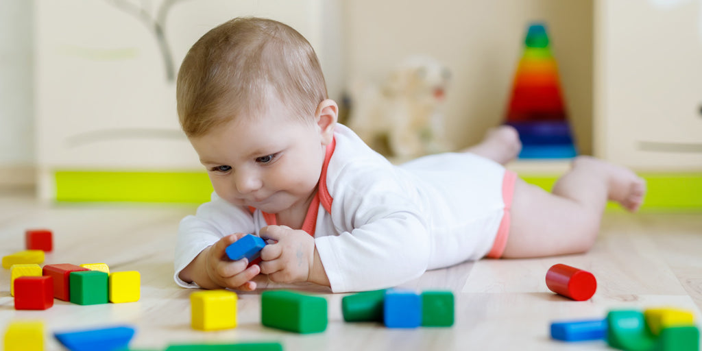
Who are you painting your nursery for - you or your baby?
And for those parents who want to stray from the traditional nursery format, there are even examples of “sophisticated nurseries that barely look like nurseries”. The choice of this sub-group raises an interesting question – are these parents decorating the nursery for their new child, or for themselves?
Surely each room will have been painted with love, but have the colours and designs been chosen because parents think they are right for their baby, or because they’ll look good on Pinterest? Hmmm…
If you want to research the issue, there is a wealth of information on the web about what colour schemes and designs are best for young babies who are just finding their way in the world.

Monochrome?
Essential baby, for example, suggests for new born babies a monochrome colour scheme – made up of shades of black, grey and white, and “filled with contrasting patterns and shapes” provides the best form of visual stimulation. As the young one moves into the second half of their first year, it advises starting to add a dash of colour – muted greens and pink are recommended.The colour vs neutral debate
Home and lifestyle website, the Spruce, offers an interesting article on the psychology of colours. In general, it states, cooler colours, such as blues and greens can have a calming effect - “think open skies and rolling waves” - while warm colours, like red, orange and yellow, can stimulate and energise.
But at the project nursery website however, parents are cautioned against using too many bright colours: reds “may invoke volatile personality traits to stand out” while “too much or too bright yellow can agitate a baby” is the advice.

Just have fun!
With a lot of conflicting advice out there, it can get confusing for parents. Maybe the best approach is the one taken by writer and mum Lauren Hufnagl writing for the website apartment therapy who, faced with a barrage of recommendations, decided to rely less on expert advice and more on her own intuition, and “instead just had fun with it”.
